
Blanding


I had a greasy burger for lunch this week and while diligently clogging up my arteries my attention was grabbed by a fridge filled with Coca-Cola, Sprite, and Fanta. Despite avoiding them considering the pain I was already inflicting on my body, I was appreciating the pops of colour, the wild fonts, and how strictly ununiformed they were. The branding feels so different from 99% of what's around us today, where everything is so bland.
Turns out, bland branding is a thing. Here are some examples of so-called blanding.
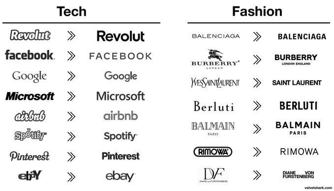
Boring isn't it? And blanding isn't just happening in brands, I fear it's happening all around us.
If you visit any UK train station built or renovated in the last 15 years or so, you'll notice that they all have the same polished metallic look. They look modern and clean, one can't complain. But that's all really. New airports have a similar feel.
And clothing, men's at least, seems to have stopped changing. In the West, it's been that same H&M/Zara look for at least 15 years (check out this H&M annual report from 2005; 17 years have passed and the clothes have barely changed).
If I time travelled from 1995 to 1985, or 1985 to 1975, it would be very clear which era I'm in simply based on how people are dressed. If I jumped from today to 2005, it wouldn't be clear at all.
It's as if everything has been focus-grouped to death. Having character or a forceful personality can be risky because it's highly likely someone won't like you. The same goes for logos and, I suppose, a bunch of things made today, from buildings to clothes to movies.
So what does one do if you don't want to upset anyone? Black sans-serif font - examples above - on white will ensure nobody is remotely offended. Nor excited for that matter.
There are some technical reasons for this, we don't really do our shopping outside anymore and products don't need to stand out on a shelf. Instead, they need to look good on a white or black screen. That's probably why I'm typing right now wearing a dark blue t-shirt with light trousers - this outfit looks clean on my computer screen. I assume few people buy Coca-Cola online so they have a license to be brave and stand out. Unless they have a website, then it's back to black on white.

There's nothing wrong with minimalist design of course. In France, I appreciate how most books have simple covers and not the garish ones we get in the UK, making bookshelves look like a paint factory has just vomited on them. And the Japanese have mastered the art of minimalism whilst also being innovative and different (and, on occasion, weird). In Japan, minimalism has certain rules and is inspired by the old practice of Zen philosophy, a long practised art. Blanding on the other hand appears to be mostly inspired by looking clear on a screen and not offending anyone. Everything moves to a middle ground.
Blanding is surely self-defeating. If you are doing the same as everyone else around you, how can one hope to stand out? For instance, how many of us obsess over (or are at least told to obsess over) social media for our work? Getting likes and follows is apparently our passport to success yet clearly if everyone is doing it the chance of succeeding is extremely low.
I have little doubt that if I were to send 50 handwritten letters to people I've interacted with in the past asking them to support a cause I'd get 75% more responses than sending a Facebook post to 100,000 people. But nobody else is doing that and I don't want to feel silly, so I won't try that...
It's hard to step out of line and I'm speaking from long experience of toeing that said line. Fairly recently I gave the OK on some branding work that indeed used a black sans-serif font for a logo. It's much easier to play it safe when you're in the thick of it with multiple parties to please.
So this little rant is me shouting at myself, I suppose. I'm telling myself off for doing what I shouldn't be doing. I should try using different styles, be a bit more daring, and perhaps wear shirts that aren't dark blue or black every now and then. I guess in a way the very existence of this newsletter is indeed a humble attempt to inject some character back into reality. We can and should all do our part to add some colour back into the world.